Table of Contents
Introduction
Graphite is free and open-source software. It is used as a time-series database monitoring tool, where you can collect, store and display time-series data in real-time. As you can monitor certain metrics of this data using Graphite, it has a very useful and simple dashboard used to visualize these metrics.
This article will show you how to display a metric on your Graphite dashboard.
MetricFire specializes in monitoring systems. You can use our product with minimal configuration to gain in-depth insight into your environment. If you would like to learn more about it, please book a demo with us, or sign on to the free trial today.
Key Takeaways
- Graphite is a free and open-source software used as a time-series database monitoring tool. It allows users to collect, store, and display time-series data in real-time.
- The Graphite Dashboard is a simple tool that helps visualize metrics. Users can set up a data source and choose the desired metric to display on a graph within the dashboard.
- Users have options to specify the data range they want to display, either by selecting a specific date range or by choosing a recent time range for viewing recent metric data.
- Graphite's wildcard mechanism enables users to visualize similar metrics collected from different sources. It allows working with groups of metric series and displaying aggregated views, such as the top five metric series from a group.
- Both the whole graph and individual metric elements can be customized on the Graphite dashboard. Users can adjust various settings such as graph titles, display options, line and area modes, X and Y-axis settings, and apply functions to single metric elements for further customization.
How To Create Dashboards
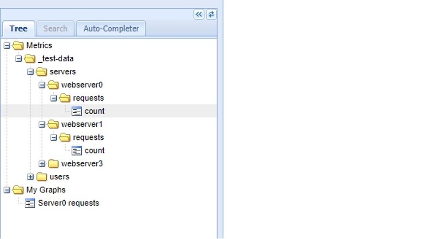
The Graphite Dashboard is quite a simple tool to visualize your metrics. Once you set up a data source, you can choose the required metric to show on a graph in the dashboard. You can access this from the browser tree on the left-hand side (as seen in the picture below) or select a metric series in the completer.
How to Set up Time Ranges
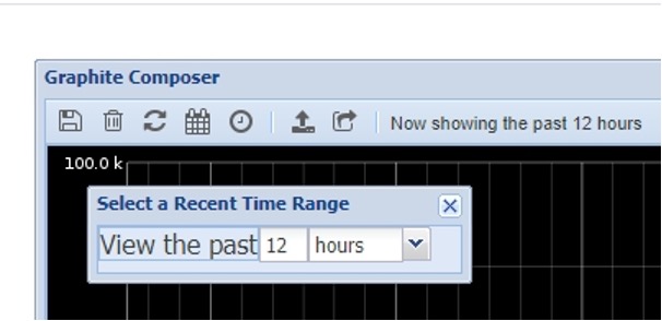
You can specify how much of your data you would like to display.
There are two options:
- Select a Date Range (define start date/time and end date/time)
- Select a Recent Time Range (specify the number of minutes, hours, days, etc to view a graph for recent metric data)
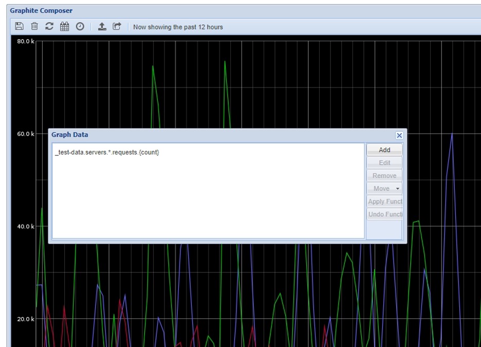
Using Wildcards and paths
To visualize similar metrics collected from different sources you can use Graphite's powerful built-in wildcard mechanism. Instead of adding each metric to the graph individually, Graphite dashboard provides functions to work with groups of metric series. For example, you can display the top five metric series from a group on the graph.
How to customize whole graphs
There are some features you can implement to change and customize the graph view on the Graphite dashboard. Here is a detailed article on the Graphite graph menu for your reference.
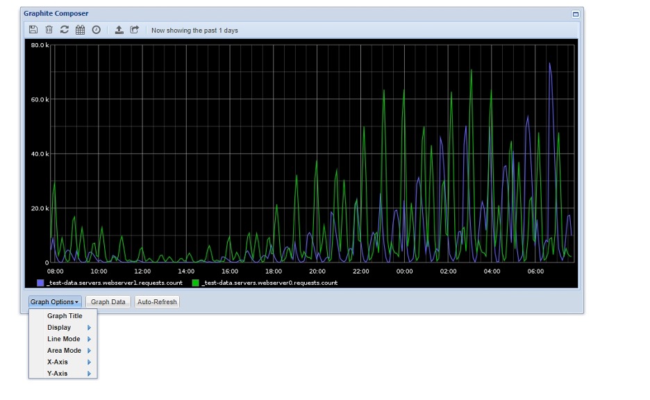
As seen in the above picture, you can customize the whole graph view by choosing and setting up the following options on the bottom left under “Graph Options”:
- Graph Title
- Display (fonts, colors, legends, line thickness, hiding of graph elements, applying a template, etc)
- Line Mode (slope, staircase, connected)
- Area Mode (define the filling area under the graph)
- X-Axis (allows setting up timezone and time format for dates/times)
- Y-Axis (setting up Y-Axis rendering: label, minimum/maximum values on the axis, unit system, step between the Y-Axis labels, divisor for the axis, etc)
To benefit even more by visualizing data from your Graphite monitoring system on the Graphite dashboard, sign up for a free trial or book a demo for MetricFire’s Hosted Graphite service.
How to customize single metrics
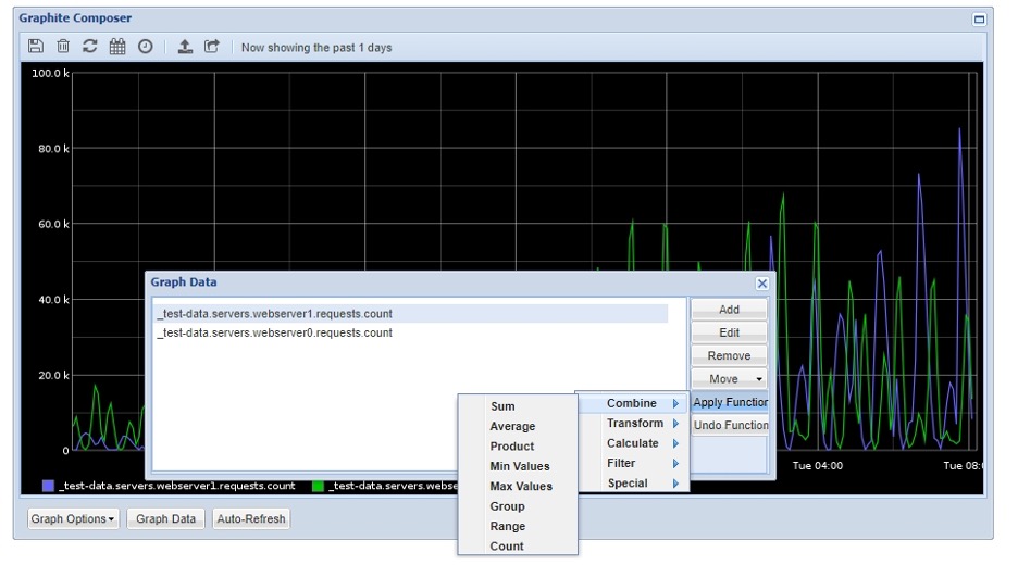
For further customization, you can apply a function to a single metric element by choosing the required elements and functions as shown above. One metric element may include multiple metric series.
The following functions are available:
- Combine (functions that you can apply to a group of metric series: sum, average, product, count, etc)
- Transform (scale, offset, derivative, power, etc)
- Calculate (operations based on new time series calculation from existing time series: average, percentage, ratio, difference, etc)
- Filter (filter metric series according to required condition: remove the above value, remove below percentile, most deviant, etc)
- Special (functions customizing specific time-series view: colors, widths, styles, etc)
On a final note, you can also save the finished dashboard, load a saved dashboard, and get a bookmarkable URL to share.
Conclusion
Displaying a metric on a Graphite dashboard can be simple, yet effective. By using Graphite’s built-in systems, you can save time while also gaining more insight into monitoring your time-series data.
At MetricFire, we provide a Hosted version of Graphite which includes storing your data for two years, a complete tool (Grafana) for data visualization, and much more. You can use our product with minimal configuration to gain in-depth insight into your environments.
If you would like to learn more about it, please book a demo with us, or sign on to MetricFire’s free trial today!