Table of Contents
Grafana is an open-source visualization and analytics tool that lets you query, graph, and alert on your time series metrics no matter where they are stored - Grafana dashboards provide telling insight into your organization. All data from Grafana Dashboards can be queried and presented with different types of panels ranging from time-series graphs and single stats displays to histograms, heat maps, and many more. Due to its flexibility with data sources and numerous bring-to-life visualization panels, Grafana has become the first choice for dashboarding among DevOps and Monitoring Engineers.
In this article, our main focus is choosing the right kind of visualizations for the most common KPIs seen in engineering and business intelligence. The choice of metrics and KPI will of course vary depending upon the company, the volatility of your applications, or the instability of your data points, but the underlying principles of dashboard creation remain the same. The ultimate goal of creating any dashboard should not be just aesthetics but to reflect appropriate data and lower the effort of the end-users in detecting abnormalities so we can reduce the mean time to solve issues.
This article will show you our two favorite Grafana dashboards. The first will be used for Infrastructure Monitoring, the second will be used for Business Intelligence.
If you jump onto our MetricFire free trial, you can start replicating these dashboards while following along with this article. Also, you can always book a demo and talk to us directly about your monitoring needs.
Key Takeaways
- Grafana is an open-source tool for visualization and analytics that allows you to query, graph, and alert on time-series metrics from various data sources.
- Grafana is popular among DevOps and Monitoring Engineers for creating dashboards due to its flexibility with data sources and visualization panels.
- The Master-Detailed methodology is recommended for creating dashboards, with a Master Dashboard displaying essential KPIs and a Detailed Dashboard offering more in-depth information.
- Visualization panels like Graphs, Single Stat, Gauges, Bar Gauges, Polystat, Tables, and Alert Lists are discussed for different use cases, such as monitoring CPU, memory, and other metrics.
- Templating in Grafana is highlighted as a useful feature for creating dashboards with variables to display different metrics efficiently.
Our Favorite Infrastructure Monitoring Dashboard
Our favorite infrastructure dashboard can be used by Infrastructure, NOC, or DevOps teams to monitor their daily operations and detect any issues with system KPIs. The number of KPIs that need to be monitored is often huge depending upon the structure and complexity of the application and its architecture. This ultimately results in the creation of numerous dashboards and the onboarding of extra resources to monitor the systems.
As a cure to the above problem, we follow a Master-Detailed methodology which starts with displaying the most important KPIs that need to be monitored on a regular basis in the Master Dashboard. After that, we display the same KPIs in greater detail in the Detailed Dashboard. To create the Master Dashboard, we carefully select panels that show our information efficiently. To create the Detailed dashboard, we use Grafana's templating feature, which allows us to layer many different time-series data onto one Graph panel.
The Master Dashboard
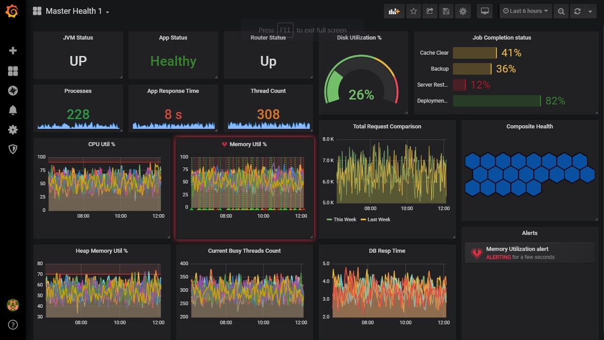
As we said before, the Master Dashboard is the overview of the most important metrics that matter to you - it amalgamates all of your KPI into one quick dashboard so you don't have to go searching for data.
While the required metrics could be varied among different teams and applications, we have listed the most regularly monitored ones here: CPU, memory, disk utilization, active thread count, active sessions, and no. of processes. Look at the image above to see the key metrics we chose. In the next section, we explain the benefits of choosing each visualization panel and the scenarios they apply to.
Graphs
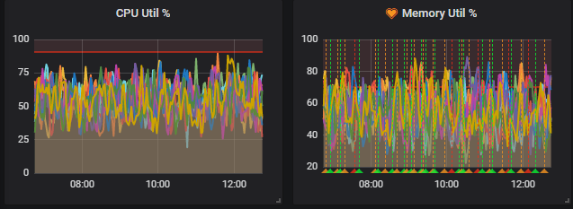
Graph Panel is the simplest and most powerful visualization panel in Grafana. They are simple and easy-to-configure time charts that display data points over a time axis. Data can easily be modified using various filters like moving average, min, max, count, average, etc. Various metrics can be correlated over the same graph, and you can use time-shift functions to compare current values over any past time frame.
We used Graph panels here to display our metrics like CPU, memory, and heap - this is for applications that are highly unstable, and data is prone to high fluctuations. Graphs, where all data points are charted over a period of time, are always good for tracking outliers or bad flips that might go unnoticed if a single stat or any other panel was chosen. Also, if you would like to overlap different metrics and compare them over time, Graph panels are the best choice. Graphs come with the additional feature of alerting and notification, which plays a huge part in detecting any state changes or triggers.
Looking to see how MetricFire can help you with the Grafana Dashboards process - and organizational insight? Now's the time! Try a free trial or book a demo.
Single Stat
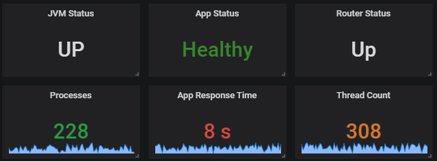
As the name suggests, Single Stat panels allow you to show the summary of a SINGLE series. This panel can be used to display values resulting from a query or display texts using value mapping conversion options. You can choose to enable sparklines on the display which renders the historical context of data in the background. You can see the sparklines on the bottom three single stat panels in the picture above. To notify of state changes, thresholds can be defined so that the entire panel gets color-coded when triggered.
In our dashboard, we used singlestat to display the server health value mapped as text. Also, we chose to represent a few other metrics like the of procs, application response time, and thread count using the same panel. Since singlestat displays only one metric per panel, you might want to skip using KPIs like CPU or RAM where every server has an individual value. Also, it’s advisable to not use Singlestat for metrics that may change states frequently. Quick flips may easily go unnoticed with the Singlestat panel.
Gauge
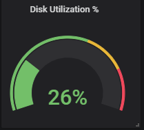
Gauges, also known as Speedometer, is similar to a Singlestat where it takes a single input series and renders the value in terms of the position it occupies within a predefined lower and upper boundary. This visualization is chosen only for KPIs that have defined boundary limits. You can mark limits and adjust thresholds that color code the display values accordingly and could easily warn users of data falling under the normal range.
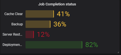
A Bar Gauge is similar to a progress bar, but multiple metrics can be queried together, where each metric represents a separate bar in the panel displaying. The bar displays the metric's current value. Bar gauges or Progress bars are efficient and meaningful when showing metrics that represent values as progress or status of completion over time. They also need predefined boundaries to be set up. We used this visualization for KPIs like job completion percentage, project completion status, etc. Bar gauges also have thresholds and color combination options that can be set in order to reflect critical states when certain values are reached.
Polystat
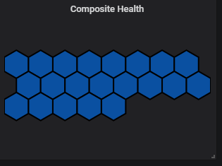
The polystat panel is one of our favorites as it gives an overview of a designated group of metrics. The polystat panel displays little hexagons or circles that represent single or composite metrics and their triggered states. Composite Metrics refer to a group of metrics that can be combined together and displayed as one. When set up with proper thresholds, the little hexagon boxes change color if at least one of the metrics in that group is in a triggered state. There are numerous customization options to make sure data is grouped and displayed optimally.
The best use case for Polystat comes when you would like to combine similar metrics together and set a common threshold for them. For example, we created a composite metric by grouping CPU utilization for all servers belonging to the same cluster as one. Since most of the servers belonging to a single cluster or application are similar, they should also share the same thresholds. In such scenarios, it's ideal to use polystat to group them as one and show one hexagon/circle on the panel. When at least one of the servers enters a triggered state, the color changes accordingly notifying the users of an abnormality.
Don't miss out on the insights! See how MetricFire can help you with Grafana Dashboards. Now's the time! Try a free trial or book a demo.
Table
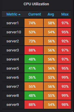
Tables are great ways to represent discrete key data for metrics. The tables panel also supports multiple modes for time series, annotation, and JSON data. The actual power of the Table comes out when you correlate data from multiple series or apply different functions to a series for comparisons. Color coding using threshold limits is one of the most powerful features of tables to detect abnormalities. Also, Tables support value text mapping in some recent versions of Grafana.
Alert List
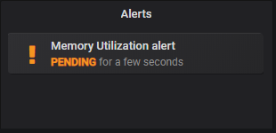
And last but not least, Alert List is a panel that allows you to display all triggered alerts from a dashboard irrespective of different panels. As of now, Alert List has limited application as not all Grafana panels are equipped with default alerting or notification mechanisms. But still, if you are a fan of Graphs and have a lot of graph charts in your dashboard, enabling alerting/notifications and listing them in a single panel is definitely a good move.
Detailed Dashboard
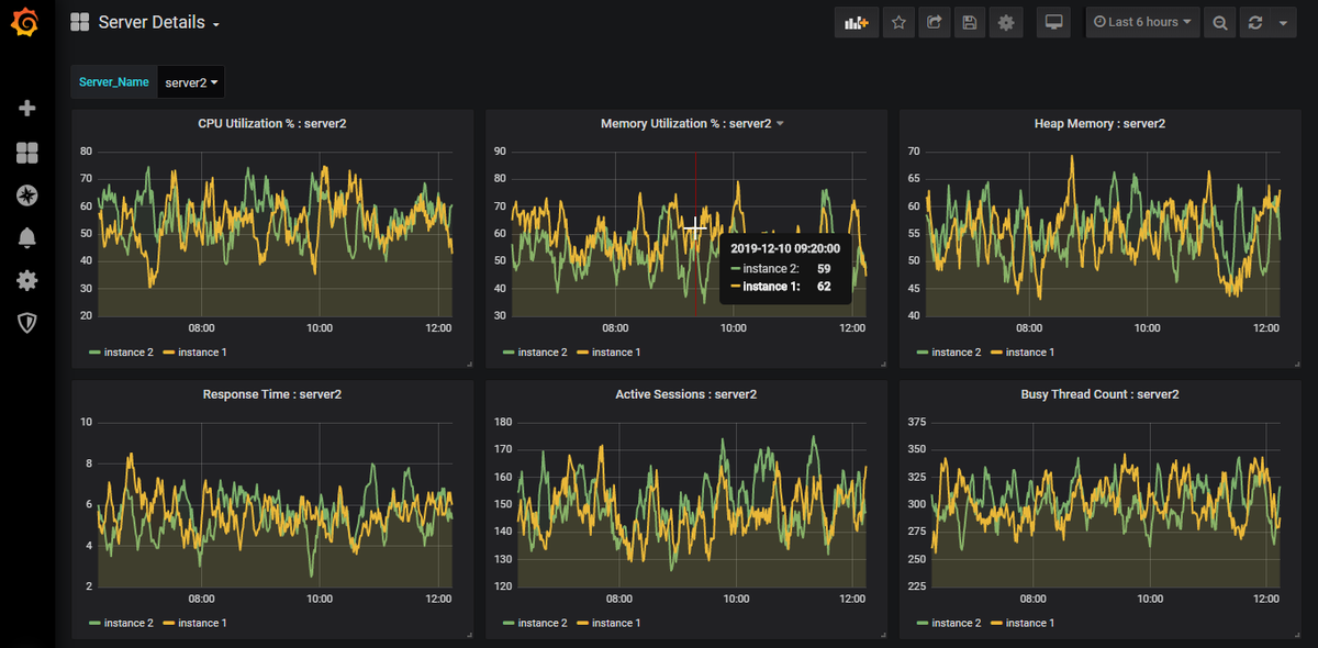
The second part of our Favorite Infrastructure Monitoring Dashboard is the Detailed Dashboard. It’s a pretty simple Grafana dashboard where we list all the metrics that are captured for a server or application. This dashboard actually serves as the explanation for every issue or abnormality being observed through the Master Dashboard. All the KPIs listed in the Master Dashboard are also part of this dashboard, but we will add extra information that isn't necessary when getting an overview that is necessary for troubleshooting.
The goal of this Detailed Dashboard is to quickly identify all of the KPIs that were impacted during an issue and identify the culprits and victims by correlating their patterns. It’s always advisable to chart all data using Graph panels so that multiple different data can be easily correlated by looking at their historical trends. Also, functional features like time-shift modification can help in analyzing issues involving the comparison of seasonal metrics like traffic trends, order trends, sales, revenue patterns, etc., and can help plot graphs for day-to-day comparisons.
Furthermore, our Detailed Dashboard is equipped with Grafana’s very own Templating feature that enables creating variables and using the same template to display different metrics, using one single dashboard, reducing overall efforts needed for creation and navigation.
As an example of its usability, consider you have 10 similar servers belonging to the same cluster. In order to view all KPIs of each individual server, you either have to create 10 different Grafana dashboards for each server or group them together in a single dashboard based on common metrics. While creating individual dashboards is too much of an effort, creating a single dashboard with all servers grouped may not be useful if you need to look at a single server's data - users would need to edit panels to hide the other servers every time.
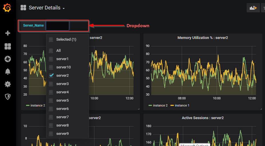
In such scenarios, templating comes to the rescue. You can easily create a variable and upon mapping it correctly to its values (i.e. server names here), select the values from the dashboard dropdown to render its corresponding data. It's a single dashboard template that fits all similar servers. Users may intend to allow multiple selections or single selections depending on their needs. This feature makes it easier to create the panels you need and also minimizes future navigation.
Our Favorite Business Intelligence Dashboard
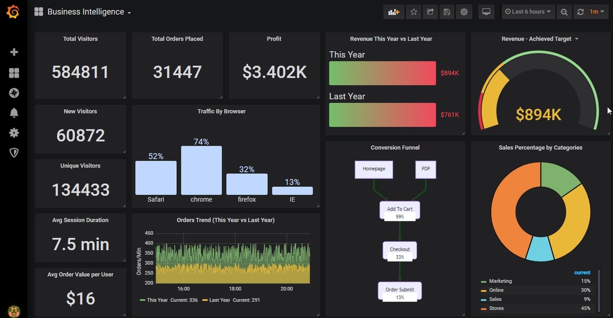
Our favorite business intelligence dashboard is widely used by a large number of companies to visualize their most important day-to-day sales and revenue data. As we said earlier, the underlying principles of creation still remain the same but the objectives and application of data change. With business reports, most people are interested in the segregation of data by different channels, devices, promotions, campaigns, geographies, etc., and also compare or trend them with the previous days, weeks, or years. Keeping that in mind, our business intelligence dashboard makes use of visualizations like pie charts, gauges, progress bars, and single stats.
Pie charting is a good way to classify sales by categories. Gauges/Speedometer are often used to demonstrate company targets and mark the current achieved status. Progress bars are normally used to show various campaigns and their current status of completion. Various KPIs like session length, average order value, and the number of unique visitors are mostly informative and usually don't need to be presented as a comparison or time series. It’s good to render this kind of information over single-value stats. Often businesses are interested in seeing conversions in the form of a funnel but unfortunately, Grafana does not have a default way to do it. Of course, indirect ways of representing the funnel data using some pictorial plugins can always be achieved.
Integration with Other Tools
A guide on the best Grafana Dashboards would be incomplete without a discussion on interoperability. After all, even a tool as powerful as Grafana doesn’t exist within a vacuum. Visualization and analytics tools like this most commonly need to be compatible with monitoring tools, and two of the most popular platforms out there right now are Graphite and Prometheus.
Both of these resources are open-source and offer real-time monitoring of time-series data. It’s the differences between the two, however, that should be the focus of your attention. If you’re not currently happy with the monitoring tool you have or are thinking of making a change, the following information regarding differences between Graphite and Prometheus should make your choice easier:
- Python was used to build Graphite. Prometheus was written in Go.
- Graphite offers data collection in a passive or push mode. Prometheus does this through active or pull mode.
- Prometheus supports Haskell, JavaScript (Node.js), Java, Ruby, Python, Go, C++ and . NET. Graphite supports Python and JavaScript (Node.js), but you can push metrics into the platform from all programming languages.
Both Graphite and Prometheus are great tools, and that’s why MetricFire offers services for each of them. Our hosted service automatically applies updates to the Grafana and Prometheus stacks, and our Graphite-as-a-Service integrates seamlessly with Hosted Graphite.
Conclusion
Each of the Grafana panels has its own best use case but it all depends on the creator and how well they know their data. If you know your data well, you will eventually find out the best way to represent it.
Get on to the MetricFire free trial and get started visualizing your data. Also, you can always book a demo and talk with us directly about your monitoring needs. Happy Monitoring!!