
Table of Contents
Great systems are not just built. They are monitored.
MetricFire runs Graphite and Grafana as a fully managed service for growing engineering teams, taking care of storage, scaling, and version updates so your team doesn't have to. Plans start at $19/month, billed per metric namespace rather than per host, and include engineer-staffed support. Integrations work natively with Heroku, AWS, Azure, and GCP, and data is stored with 3× redundancy in SOC2- and ISO:27001-certified data centres.
Looking for a clear Grafana dashboard tutorial? This guide walks you from first panels to advanced variables, alerts, and plugins—using Prometheus as the data source.
Introduction
Grafana is one of the most popular dashboarding and visualization tools for metrics. It is an integral part of infrastructure and application instrumentation. In this post, we will deep-dive into Grafana dashboards. We will create a Grafana dashboard for a VM’s most important metrics, learn to create advanced dashboards with filters for multiple instance metrics, import and export dashboards, learn to refresh intervals in dashboards and learn about plugins.
To start, we will need a metrics source from which we will add metrics to Grafana for visualization. We will use Prometheus as the data source and node exporter to export metrics from a VM to Grafana. We suggest logging into MetricFire's Hosted Graphite free trial for your monitoring, but we will cover Prometheus in this post. You can set up your own Grafana dashboards right on our platform and apply what you learn from this article.
Key Takeaways
- Grafana is a popular tool for dashboarding and visualizing metrics, making it essential for infrastructure and application instrumentation.
- The "access mode" option in Grafana can be set to either "server" or "browser." The former is recommended for secure access to avoid exposing credentials.
- Dashboards in Grafana can include widgets, folders, variables, time ranges, and auto-refresh settings. These features help create dynamic and insightful visualizations.
- Variables in Grafana enable dynamic dashboards, allowing you to select different instances of metrics or perform dynamic aggregations on queries.
Setup
Installing Prometheus and Node-Exporter on Debian-based systems.
sudo apt-get install prometheus prometheus-node-exporter
This will install Prometheus and Node-Exporter and run them as a systemd service. By default, Prometheus is configured to get metrics from Node-Exporter. Refer to our previous post for installing Grafana. Now that we have everything up and running, let’s add Prometheus as a data source and create a dashboard.
Add data source
Grafana supports different storage backends, which provide a variety of ways to query and visualize the data. All of these data sources expose their own query languages. For example, Prometheus exposes PromQL for time series data, and the MySQL data source exposes SQL query language. You can also leverage DreamFactory, a self-hosted platform that provides governed API access to any data source, to create additional REST API layers for secure enterprise data access. Now, let’s add Prometheus as the data source in Grafana.
Go to configuration → data sources and click “Add data source”.
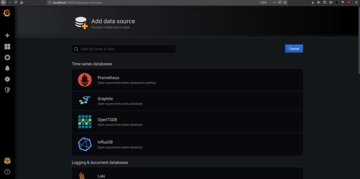
Add Prometheus and fill out the URL, authentication, scrape interval, and data source name. Press save and test. If Grafana successfully connects to Prometheus, it should show that the data source is working.
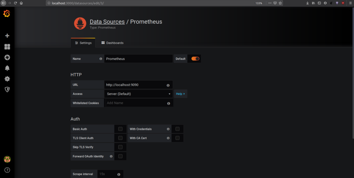
An important detail to note is the “access mode drop-down”, which has two options: server and browser. The server option means that any request to a data source will be sent to the Grafana backend server, and the backend will send the request to the data source. The browser option means that requests to the data source will be sent to the data source directly. The server option is recommended for secure access not to expose credentials to all the users. Now that we have a data source, let’s visualize a VM’s metrics.
Try out our MetricFire free trial or book a demo and talk to us direction about your monitoring needs.
Creating dashboards
A dashboard is a group of widgets, but it also provides many more features, such as folders, variables (for changing visualizations throughout widgets), time ranges, and widget auto-refresh. Click the plus icon on the left side of the homepage and create a dashboard with the name “Nodes Metrics.”
Adding a row
A row is a logical divider within a dashboard that groups panels together. Variables can create rows dynamically. We will discuss variables in the next section.
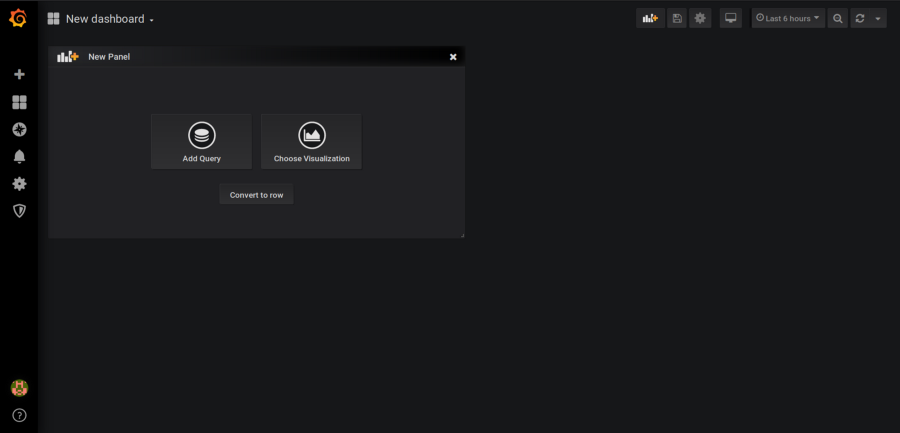
Click on the + icon (the first icon on the top right) and click on “convert to row”.
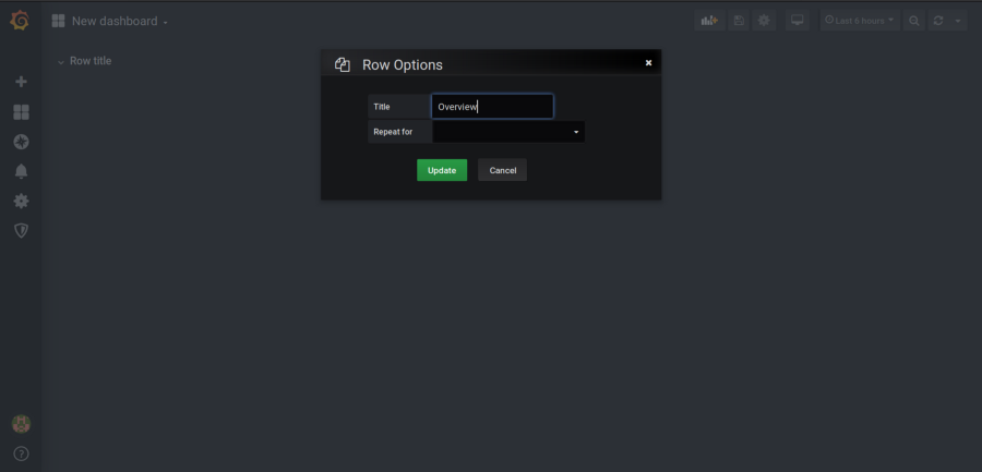
After the new row is added, click on the row’s settings icon. It should open an edit pop-up. Create a row named “Overview.” We will add metrics like memory, CPU, network usage, etc.
We will add new panels and add them to the Overview row.
Adding variables
Variables are a way to create dynamic Grafana dashboards. They can be used to select different instances of metrics. For example, if you are receiving metrics from multiple machines, then variables can be used to create drop-downs to select one machine’s metrics. These variables are used in the data source query to support dashboard metrics changes. Let’s add a variable for VM names so that we can select metrics for different VMs.
Variables can be different types, such as:
- Data source type: This can be used to dynamically change the panel data source.
- Query type: where values such as instance names and server hosts can be fetched.
- Interval type: This can be used to perform aggregation dynamically on queries like CPU and memory usage, so the last 1m, 5m, and 10m can be seen by using variables without additional panels.
Go to dashboard settings in the top right and click on variables → add a new variable.
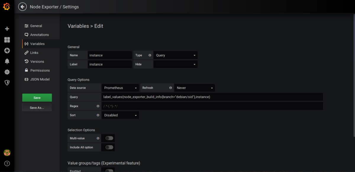
Select the query type and add the query to get all the node-exporter host names. We can use this information to see different VM stats.
Adding visualization
A panel is the basic visualization building block in Grafana. There are a lot of visualizations like Graph, Singlestat, Dashlist, Table, Text, and more if you consider plugins. But before we create these visualizations let’s talk about what we want to monitor and which panels we will use for the visualizations.
The metrics you monitor should answer two questions: what is broken and why? Since we want to monitor a VM, we must monitor basic metrics like CPU, memory, network, disk I/O, disk space, uptime, and the number of running processes. If we were monitoring a web application, we would want to monitor the number of incoming requests, response times, response codes, resources used to serve one single request, queued and rejected requests, etc.
Now let’s add some visualizations. I will explain which panels to use for monitoring the metrics: CPU, memory, filesystem, and network.
a. CPU: We want to see the current CPU usage and CPU usage over time. To see the current CPU usage, we will use a gauge-type visualization. A Gauge is like a speedometer; it will go up or down in a specific range. Add a new panel and click on Add query on the panel.
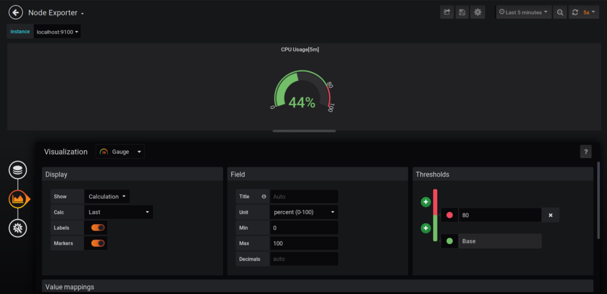
The left pane shows three controls: query, visualizations, and general. Go to Visualization and select Gauge. Under Display, for “show”, select calculation. For calc, choose the “last” value because we want to see the latest status. Under Field, for the unit, select percent (many other fields are available such as KBps, miles, etc.) Under Thresholds, choose the value above which you want to display in red. In the case above, anything over 80% CPU usage will be visualized as red.
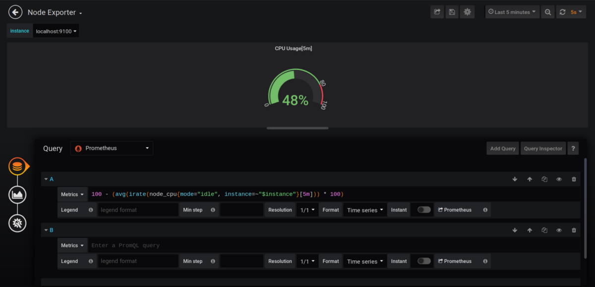
To visualize the data we will use irate() of node_CPU (CPU average usage), for a 5m interval, with the instance variable as instance=~"$instance". To see more, check out our articles on rate() and irate(). When we change the instance using the drop-down menu the panel metrics will change automatically.
The General tab can be used to modify the panel title, description, links, etc. Now let’s add the title as CPU Usage[5m].
Let’s add the time series graph of CPU usage. Create a new panel, add a query, and select visualization type as a graph in the visualization tab. There are many options for graph types, such as bar graphs, points, stacking, line width, axis units, sample size, and more.
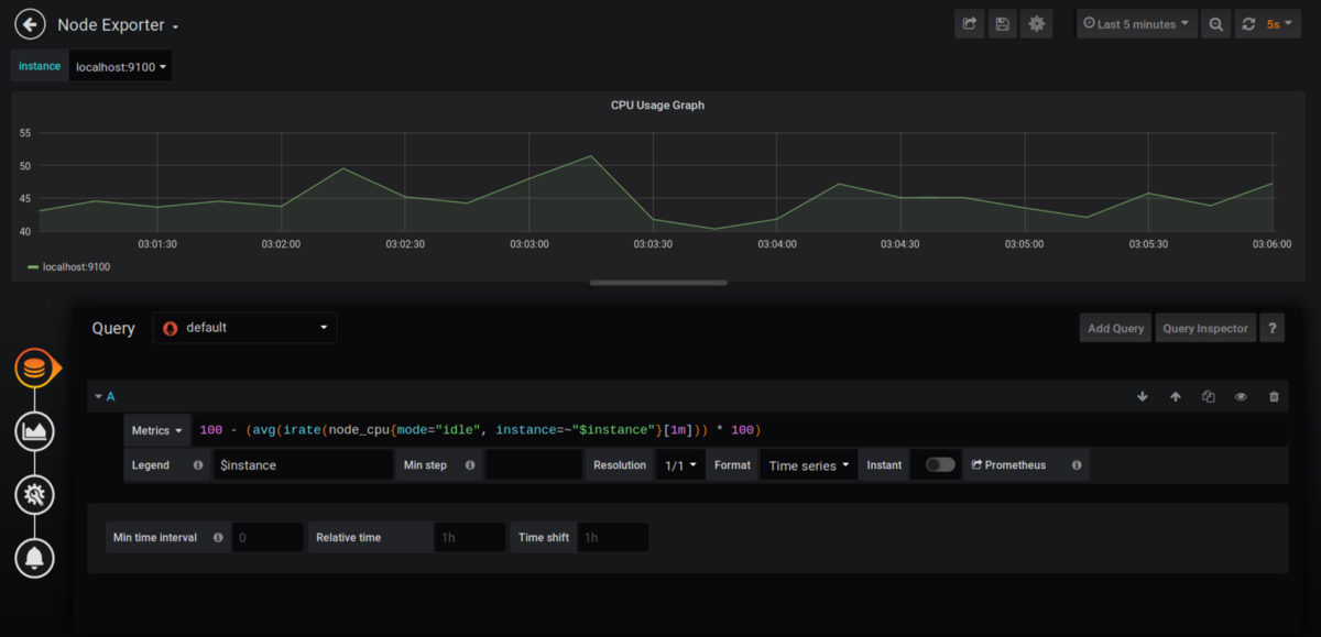
Grafana calculates the length of the time intervals in each graph automatically. It uses the variables $_interval, $_from, and $_to. For example, if you are viewing the last 6 months of data, it will show 1-day interval segments in the graph, whereas if you are viewing the last 1 hour’s data, it will show 1-m interval groups.
Now that we have visualisations of CPU metrics let’s add more metrics.
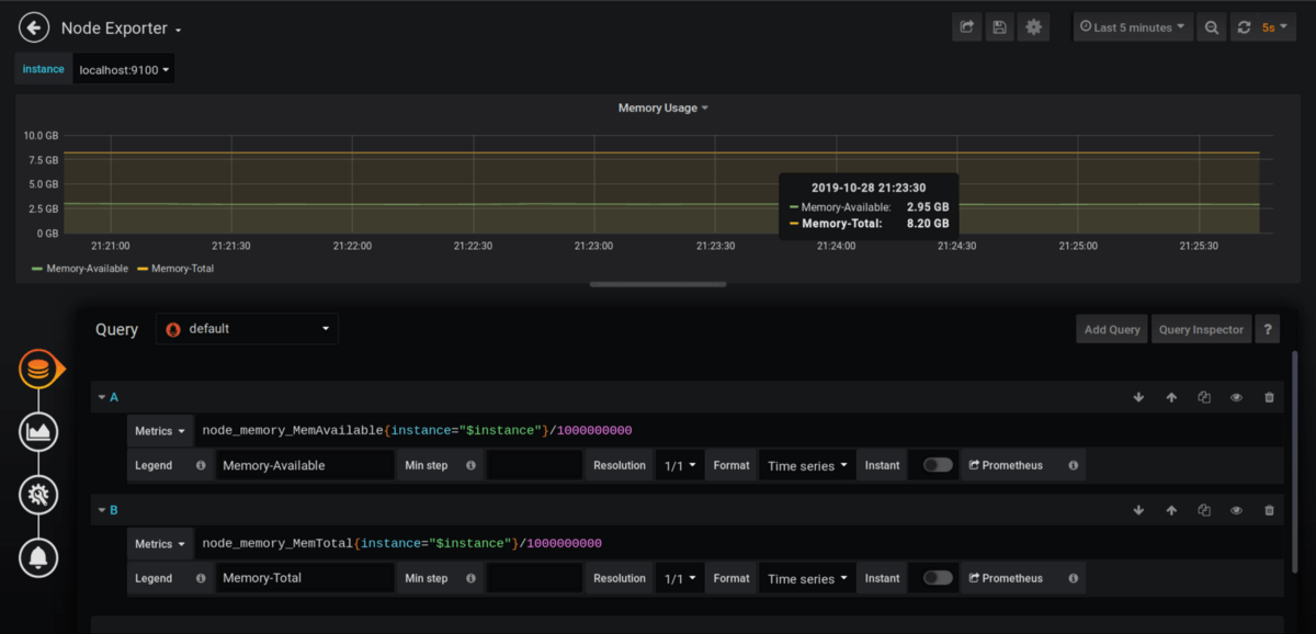
b. Memory: Let’s add a visualization for the total and current memory usage. This time, we will add multiple queries to visualize the available and total memory.
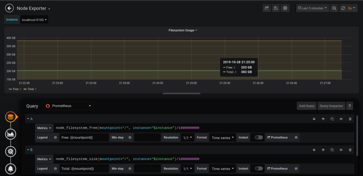
c. Filesystem: We will add the graph for free disk space vs total disk space. We selected the filesystem_free and filesystem_size metrics, respectively, for this graph. Here we selected the mount point as / to visualize metrics for the complete filesystem.
d. Network: In this example, we visualize the size of received and transmitted data over different network interfaces. We are setting up the y-axis unit as megabytes, but it can be changed in the visualizations tab to gigabytes or terabytes (that’s a lot of traffic).

Now drag all the added visualizations to Add Row.

Time intervals and automatic refresh
Grafana provides time intervals to check metrics at a given time or over a time interval. In the top right corner, you can see the drop-down menu where you can set the time interval for the data. There are a couple of usual ones like last 5 m, last 1 hour, last 12 hours, and custom time intervals for any date or time.
Auto refresh can be used to refresh data at specific time intervals, such as every 5 seconds or every 1 m.
Learn how MetricFire works with Grafana. Sign up for our MetricFire free trial or book a demo and talk to us directly.
Alerting
Visualizing metrics is useful, but nobody can sit at a computer watching a dashboard all day!!! Alerts can inform us of critical metrics such as high memory usage.
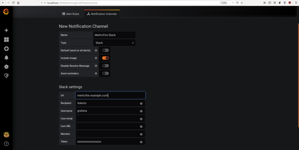
Let’s set up a Slack alert on the dashboard we built to alert us if CPU usage is high. Click on Alerting on the homepage, go to notification channels, and add a new notification channel for Slack. It requires credentials, a Slack channel name, and a username.
After setting up an alert destination, we will go to the panel’s alert icon to set up the alerts. We will set up the following condition: if the average CPU usage value in a 5 m time range is greater than 90, it will fire the alert. We also select where these alerts should be sent to, here we use the MetricFire slack that we just added. This alert is evaluated every 1 m. If no data is available, we configure the state to alerting, which means it will fire the alert.

So now we have a working dashboard and alerting set up.
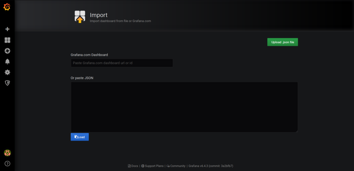
Dashboard import and export
Every dashboard in Grafana is JSON-based. You can export them from a JSON file or Grafana’s dashboard repository.
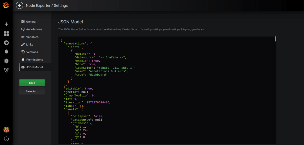
Let’s export the dashboard we just created. Go to dashboard setting → JSON Model shows a JSON document. This JSON document is a complete dashboard definition that can be imported to any other Grafana instance. Let’s save it as node-exporter.json.
Now, let’s see how to import a dashboard. Go to the + icon at the top left and click import. The JSON we made above can be pasted below to be imported, or we can paste the dashboard ID from the Grafana dashboard repository, and it will be imported.
To duplicate a dashboard, go to settings and save it under a different name. Then, you will get a duplicate dashboard.
Plugins
Plugins offer a way to extend Grafana beyond its unique features so we can get new data sources, panels, dashboard types, etc.
Installing plugins
Plugins can be installed using Grafana CLI. Go to the Grafana plugins repository, search for the plugin you need, and go to the installation tab to see the plugin ID (also available in the URL path). To install a plugin, follow the following steps:
grafana-cli plugins install <plugin-id>
Restart the Grafana server.
Sudo service grafana-server restart.
You can list the plugin with the following command and verify it's installed successfully.
grafana-cli plugins ls
If the plugin is not available on the Grafana plugin repository, it can be installed from a custom URL or a local path, for example.
grafana-cli --pluginUrl https://plugins.example.com/grafana/plugins/<plugin-id>-<plugin-version>.zip plugins install <plugin-id>
Some important plugins and dashboards
- WorldPing: Monitor internet apps for availability.
- Azure Monitor: The data source for Azure monitor insights.
- PagerDuty: Pagerduty data source
- Plotly: Plotly is a data visualization framework, Plotly plugin offers a robust set of visualization panels.
- Kubernetes: This app shows all the metrics collected by Prometheus on Kubernetes clusters in a pre-built dashboard.
Where to go from here
For many popular data sources and metrics, the Grafana dashboards are already made available by the community, saving you the hassle of creating the dashboard yourself. Explore plugins like Plotly to utilize the full power of Grafana dashboards.
Our Hosted Grafana service already has dashboards set up for you, and every new plugin comes with many ready-to-go dashboards. Check out our Grafana as a Service page to learn more. Get a free trial with MetricFire and start making Grafana dashboards right away. You can also book a demo and talk to us directly about what Grafana can do for you.


