Table of Contents
- Introduction
- Key Takeaways
- The best IoT monitoring stack
- Why we need IoT monitoring
- Monitoring a smart home
- The Architecture of Monitoring IoT
- The metrics we will monitor
- Building IoT dashboards
- Filtering, aggregating, and using functions on queries with PromQL
- Setting thresholds
- Appropriate visualization types
- Conclusion
Great systems are not just built. They are monitored.
MetricFire is the fully managed Graphite and Grafana platform for small teams that don’t want to self-host their monitoring stack. Pre-built dashboards, alerts, and native add-ons for Heroku, AWS, Azure, and GCP. All with dedicated support and no infrastructure to maintain.
Introduction
The Internet of Things (IoT) - is a number of physical devices connected to one network that enables the system to interact with the external world. A great deal of the work surrounding IoT is monitoring, as it’s impossible to react without knowing the situation.
For example, we might build a greenhouse system for agriculture that can maintain optimal conditions for growing crops. For this purpose, we need to have sensors picking up information about the temperature and humidity. All this data should be stored and processed automatically to enable watering and heating.
Key Takeaways
- Internet of Things (IoT) Basics: IoT involves connecting physical devices to a network to enable interaction with the external world. Monitoring is crucial for IoT systems, as it helps respond effectively to various situations.
- IoT Monitoring Stack: A recommended stack for IoT monitoring includes Prometheus for data collection, storage, and processing, along with Grafana for visualization.
- Importance of IoT Monitoring: While an ideal IoT system would be fully automatic, real-world factors like device vulnerabilities, weather, and mechanical issues necessitate monitoring. Human involvement is required for system operation and maintenance.
- Architecture and Implementation: An example of monitoring a smart home system is provided, where sensors send data to a hub, then to an API endpoint using MQTT or HTTPS. Data can be stored using cloud services or Prometheus Pushgateway. Grafana is used for creating dashboards.
- Monitoring Strategy: IoT monitoring is divided into infrastructure and situational logic. Infrastructure monitoring involves tracking data from sensors to detect issues, while situational logic focuses on monitoring relevant data for specific situations, aiding efficient resource usage.
The best IoT monitoring stack
A great stack for IoT monitoring is Prometheus and Grafana.
The data collection, storage, and processing can be done with Prometheus, and the visualizations can be done with Grafana. This article won’t go in-depth on the basics of Prometheus and Grafana, instead, we will focus on what you need to know to make a great IoT dashboard using these tools.
To get more on the basics, you should read our Prometheus 101 article here, and our article, Getting Started With Grafana.
This article also won’t go into how to connect edge devices to Prometheus and Grafana. To learn about how to connect MetricFire to an IoT device, check out our article on monitoring a Raspberry Pi 4.
Especially for large-scale IoT monitoring, you should consider monitoring with Hosted Graphite by MetricFire. Hosted Graphite (a Prometheus alternative) gives you automatic scaling, updates, plugins, Grafana dashboards, and more. You should sign up for the MetricFire free trial here, and start building your IoT dashboards.
Now, let’s take a look at the core concepts behind monitoring IoT, and learn to build a dashboard in Grafana for monitoring an IoT system.
Why we need IoT monitoring
Wouldn’t it be great if our IoT system was fully automatic, making it so that humans didn’t have to do anything? Why do we even need a dashboard? Can’t the water sprinkler in the greenhouse turn on by itself?
Ideally, human involvement in our IoT systems would be 0. However, we all know that this world isn’t perfect. IoT systems are made up of hundreds of sensitive components that are vulnerable to weather, mechanical damage, or even battery power.
It is possible, and even common, that other parts of a production pipeline also break up. This can be caused by both people and machines. Additionally, very few businesses are fully automated, so humans still need to participate in the monitoring and operating of IoT systems.
Monitoring a smart home
As an example, we are going to monitor a system that measures pressure, temperature, and humidity at home, store all the data in Prometheus, and visualize it with Grafana. Below you can find the possible schema of how this can be implemented.
As you can see, there are 3 edge devices (sensors) that send data to a Hub and then to an API endpoint via MQTT (message queuing telemetry transport - a lightweight messaging protocol for small sensors and mobile devices, optimized for high-latency or unreliable networks) or HTTPS.
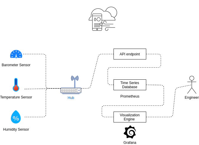
You can use either cloud services or Prometheus Pushgateway to store data in the database. In more complicated tasks you may also need StatsD to aggregate the data. Then, we can connect Grafana to Prometheus and build dashboards.
The Architecture of Monitoring IoT
We can divide our monitoring strategy into two main categories: situational logic and infrastructure.
Infrastructure
Let’s describe the infrastructure part first. Sensor devices are fragile, they can be discharged or just lose packages because of network issues or bad architecture. That is why we need to have the ability to monitor how often, how many, and what data we receive from each sensor.
With this kind of data, we can detect which sensor is broken, discharged, or has lost data. It is also helpful to have alerts that will inform specialists to solve the issue. With these analytics, you can also estimate which infrastructure you really need to handle this amount of data (this is critical for huge systems with thousands of sensors).
Situational logic
Having good situational logic will guide you to monitor the things that are important to your situation. For example, if you’re monitoring data from a smart home, it makes sense to calculate this data only for the time you are at home (if nobody is at home it makes no sense to cool or heat air to an appropriate temperature).
It also makes sense to calculate values for specific times, like nighttime where it’s ok to keep the home temperature cooler.
It also makes sense to create an alert on some metric values. For example, the optimal humidity minimum is 40% and the maximum is about 70%. If you measure a humidity value higher than 70%, your dashboard should let you know.
You must decide how many devices you want to monitor and which data you want to extract in order to build an optimal dashboard. In our smart home example, it’s not so important to have a history of temperature and humidity.
Here we mostly care about the current temperature or at least the current temperature throughout the day. In another case, IoT for the agriculture sector might require a dashboard for historical trends.
The metrics we will monitor
In our example, we will monitor the following metrics:
- humidity_gauge_percent
- pressure_gauge_pa
- temperature_gauge_c
It is often a good idea to capture the units of the metric in the metric name. You can see this practice exhibited in our metric names above. See Prometheus documentation on naming metrics for more information.
To get these metrics into Prometheus, you will need to set up your Prometheus to scrape the API endpoint visualized in the above diagram. To see one method for doing this, check out this tutorial here.
For all data querying and manipulation, we will use PromQL. Some basics will be explained here, but we recommend you get a good understanding of PromQL by reading this article.
So, let’s start with building the dashboard:
Building IoT dashboards
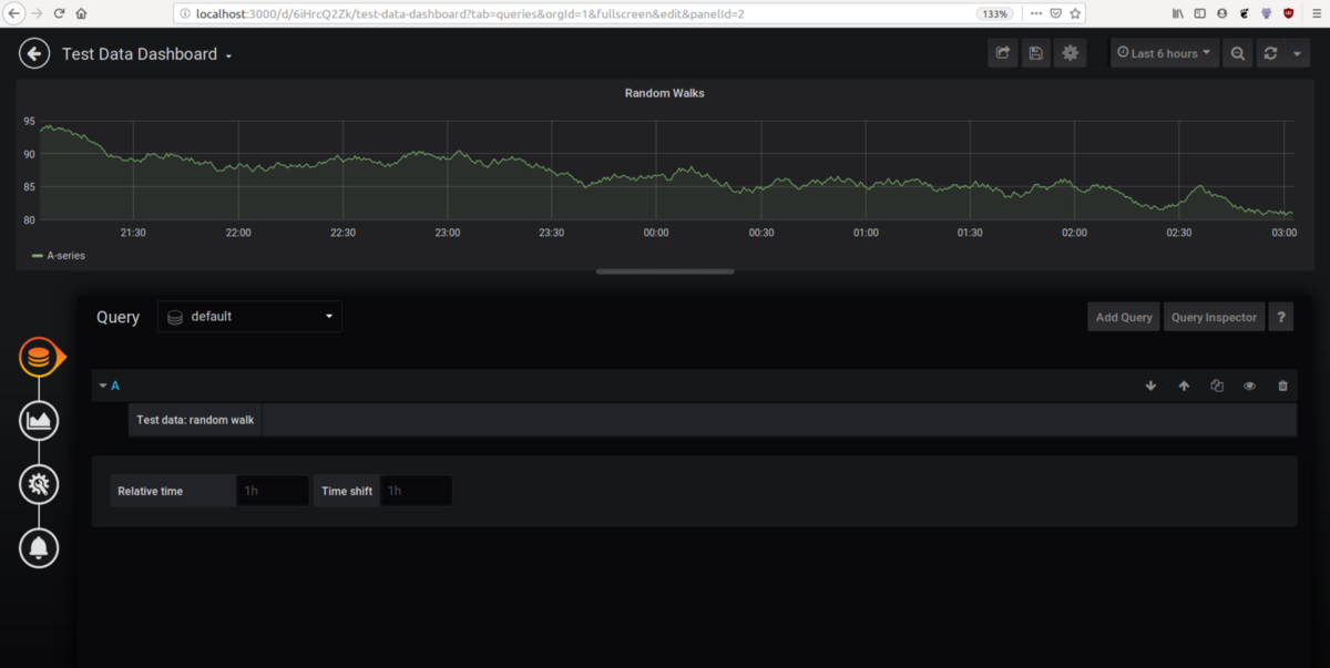
To start building your dashboard, go to the plus sign on the left-hand side of the home page, and add a new dashboard. Then add a new panel and add a query. You can see the beginning of a new dashboard in the image below:
For more instructions on how to build a Grafana dashboard from scratch, read our full tutorial here.
For our IoT dashboard query, we want to query our Prometheus database, so we will query that database using the metric names listed above.
Start building the query for ‘humidity_gauge_percent’ by querying just the metric name. Depending on the conditions and sensors, it’s possible to have noise in the data and get results like this when we do just a basic PromQL query of ‘humidity_gauge_percent’:
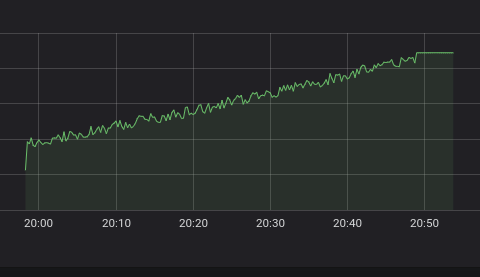
If you want to remove the noise, we can apply the following PromQL function when we query the metric. Just write the following query into your query expression field:
avg_over_time(humidity_gauge_percent[5m])
This PromQL expression transforms the query in two ways.
- The first one is ‘[5m]’ which just splits our data vector into a range vector. For each point in time, the range vector holds an array of 5m of values. (As you probably know, we can't display just humidity_gauge_percent[5m] because this is not a series with a timestamp - value, but grouped subseries.)
- Then, we take the average over time.
As a result, we will get the following:
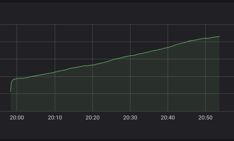
The above graph is much smoother and the data is easier to apply. If you do not specify the legend for a query, you will see an automatically generated legend, similar to the one below:
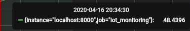
You can also find the exact same information by querying directly in Prometheus. If you go to your Prometheus Expression Browser, then go to the Prometheus Status > Targets page in the Labels column, you will see the same metric:
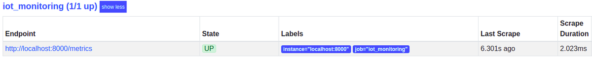
This is notable because it shows you which labels are associated with that metric.
Filtering, aggregating, and using functions on queries with PromQL
Filtering queries
It is possible to filter your metrics by the labels, such as the ones seen in the image at the end of the previous section. To query a specific instance, all you need to do is add curly brackets after the metric’s name and specify the key-value pair you are looking for, separated with an equal sign. For example:
humidity_gauge_percent{instance="localhost:8000"}
Remember that you can use variables to determine which instances you want to visualize at the moment. For more information, read the documentation. Variables can be custom or already predefined. This is a very powerful instrument you can use for building an aggregated dashboard for each room or region. But, in our case, we have only 1 instance per sensor, so we won’t be using this application now.
Using functions on queries
If you want, you can also apply a simple linear regression model to predict the value of the future.
predict_linear(humidity_gauge_percent[10m], 300)
In this example, we will predict the value for 300 seconds in the future by 10 minutes range. predict_linear should only be used with gauges. Ensure your dashboard works with now+(prediction interval) for an upper boundary, otherwise, you will miss the prediction. You should also know that the boundaries are installed for the whole dashboard, and not each panel separately.
Another great function is the changes function:
changes(humidity_gauge_percent[1m])
This function will show you the number of changes per specified time range (in our case: 1 minute). What can we get from this? If the data is not changed for a long period of time, we know the likelihood of a problem is high.
Also, it’s recommended to collect some metrics related to network information, such as sensor status information, like power charge. These will help you detect sensors that are in the danger zone to become broken.
Aggregating queries
In many cases, you need data for each instance, as well as aggregated data. Here are some aggregation operators for PromQL:
- sum - calculate the sum over dimensions
- min - select minimum over dimensions
- max - select maximum over dimensions
- avg - calculate the average over dimensions
- stddev - calculate population standard deviation over dimensions
- stdvar - calculate population standard variance over dimensions
- count - count the number of elements in the vector
- count_values - count the number of elements with the same value
- bottomk - smallest k elements by sample value
- topk - largest k elements by sample value
- quantile - calculate φ-quantile (0 ≤ φ ≤ 1) over dimensions
For example, with bottomk you can select a series from the coldest rooms in your house (if you have more than one thermometer sensor). The syntax can be found in the official documentation, but here is an example of usage:
bottomk (2, temperature_gauge_c)
That will return 2 series with the lowest temperature. You can also group aggregation by labels with keywords ‘without’ or ‘by’.
NOTE: aggregation operators are not the same as the query functions you saw before. These operators aggregate data per dimension (where a dimension is a label). On the other hand, query functions operate on data by time ranges, such as every 5 minutes.
Setting thresholds
The next step is to set the thresholds for the chart. Go to the Visualization tab and configure:
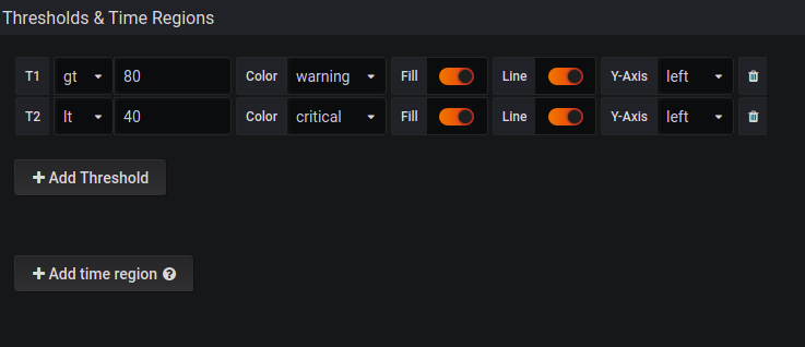
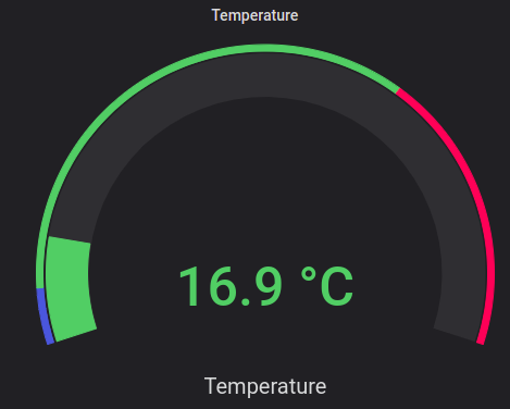
You can set thresholds, where the color on the gauge will change if the value goes over a certain limit. It’s also great to have configured alert rules to react as fast as possible.
We can use the following query to detect if the instance is healthy:
up{job="<job-name>", instance="<instance-id>"}
Using this query we will see if the instance is healthy, i.e. reachable, or 0 if the scrape failed.
Appropriate visualization types
Do not forget to use the appropriate visualization type for your data and needs. For example, the graph is better for multiple values, trend detection, and comparison. Gauge is great to show some aggregated data, and current values, and to visualize where the current value is in relation to the thresholds.
Conclusion
Sensors produce a high amount of useful information, and to process it we need to have dashboards. The specifications for the IoT are that we often have multiple instances of some devices, so we need to apply certain variables to be able to monitor each group and instance separately while getting as many as possible.
Sensors are very fragile, so we should carefully monitor the sensors themselves, and not just the situational metrics. It is important to not only detect the problem but also react as fast as possible. That is why we should also configure an alerting system to be always informed about the system status.
As you can see, setting up a system requires significant work. To reduce the configuration time, use the MetricFire free trial to use Hosted Grafana. You can also book a demo and talk to us directly about how to best set up your IoT dashboards.